Kinetic typography: examples, rules and how to make it
What moving type is for, the numbers that keep it readable, and how to build it with an AI agent without losing control of the words.

Zouhair Majzoub · Founder
Updated November 2026 · Guides · Zouhair Majzoub, Founder · Nov 18, 2026
Kinetic typography is text that moves to carry meaning: words that arrive, swap, grow and land in time with what they say. It works when every word stays large enough, long enough and clear of the interface to be read, and it fails the moment the motion takes over the reading.
This guide is for founders, marketers and designers who make launch videos, explainers and Reels, and for anyone who lets an AI agent set the motion. It covers what kinetic typography is, where it comes from, the readability rules in numbers, and a workflow you can follow from the first word to the export.
What is kinetic typography?
Kinetic typography is an animation technique that sets text in motion to express an idea, an emotion or a rhythm. Wikipedia sums it up as "the technical name for 'moving text'". "Kinetic type" and "motion typography" mean the same thing in practice.
The words are the actors. They enter, change, push each other aside or grow until they fill the frame, and each move is chosen for what the sentence means: a reveal rises, an impact drops, a correction rolls over.
Research on the subject splits it into two families. In Barbara Brownie's model, as Wikipedia summarises it, motion typography moves text around the frame (a scrolling crawl, or words travelling relative to one another), while fluid typography changes the letterforms themselves without moving them. Most product and social work belongs to the first family. The second shows up more in title design and art pieces.
Kinetic typography examples, from film titles to feeds
- 1959. Saul Bass designs the opening titles of Alfred Hitchcock's North by Northwest: credits glide along a grid that dissolves into the glass facade of an office building. Art of the Title notes that it is often credited as the first title sequence to use kinetic type.
- 1960. Bass uses a similar technique for Psycho, according to Wikipedia's history of the form.
- 1982. Martin Lambie-Nairn's first ident for Britain's Channel 4 puts kinetic type at the centre of television branding (Wikipedia).
- 1995. Kyle Cooper's titles for Se7en use lettering hand-etched on scratchboard, then made to smear and jitter during the film transfer (Art of the Title).
- Today. Lyric videos, launch films, explainers and Reels, where the words on screen often have to tell the story without sound.
The sequences above are worth watching in full on their official releases or on Art of the Title; we describe them rather than reproduce them.
Kinetic typography vs animated captions
Animated captions (subtitles that pop in and highlight each word as it's spoken) are useful, and they follow the same reading rules. But they do a different job.
| Animated captions | Kinetic typography | |
|---|---|---|
| Purpose | Transcribe what is said | Carry the message itself |
| Amount of text | Everything that is spoken | Three to seven words per scene |
| Timing | Follows the voice | Follows meaning and music |
| Layout | A strip near the bottom | The whole frame, composed shot by shot |
| Motion | One entrance, repeated | An entrance chosen for each sentence |
A simple test: mute the video. If it no longer makes sense, you made captions. Kinetic typography should stand on its own, sound off.
Kinetic typography styles you can use
A text's entrance is the first thing a viewer reads. These are the common ones, with what each tends to say:
| Style | What it says | Typical setting |
|---|---|---|
| Rise from a mask | A reveal | Words rise from behind an invisible line |
| Drop from above | An arrival, an impact | Short travel, a firm landing |
| Arrive from depth | Importance | Scale 2.4 → 1 on a decelerating curve |
| Word by word | A sentence building | 0.06–0.12 s between words |
| Letter by letter | Texture | One frame apart, short words only |
| Typed | A product, code, a search | 18–28 characters per second, a blinking caret |
| Blur to sharp | Focus | 8 px → 0 in 0.15–0.2 s |
| Slot-machine roll | A correction, a value that changes | One word rolls, the line stays |
| Swap in a fixed sentence | A list of benefits | "Edit ___" with a new word on each beat |
| Grow to fill the frame | A transition | The key word becomes the next background |
The settings come from the Kinomo skill, the guide our app gives to AI agents, and they are good starting values for any tool. Three rules keep the result from looking like a template:
- Choose the entrance by meaning, and don't use the same one twice in a row.
- Never grow a word from nothing. Text that scales up from zero reads like a pop-up ad. Start from 0.94–0.95, from depth, or behind a mask.
- Once a word has landed, it stays still while it is being read. Motion during reading is what makes kinetic type tiring.
Kinetic typography rules: readability in numbers
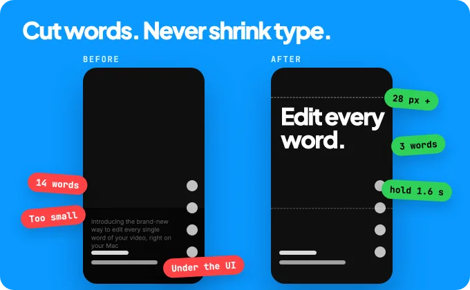
Kinetic typography fails on the same few points every time: text too small, too long, too fast or under the interface. Here are numbers you can check.
| Rule | Number | Where it comes from |
|---|---|---|
| Size | Characters at least 2.6 % of the frame's short side: 28 px on a 1080-wide vertical video | Kinomo's text check (a studio rule) |
| Length | Up to 8 words in one text, 12 visible together | Kinomo's text check (a studio rule) |
| Reading speed | 160–180 words per minute, about 0.3 s per word minimum | BBC subtitle guidelines |
| Hold | At least 0.6 s + words ÷ 3, counted once the text is still (2.6 s for six words) | Kinomo's text check (a studio rule) |
| Contrast | 4.5:1 for normal text, 3:1 for large text | WCAG 2.2, success criterion 1.4.3 |
| Vertical safe zone | No text in the top 14 %, the bottom 35 % or 6 % on each side | Meta ads guide, Reels and Stories |
| Flashing | No more than three flashes in any one second | WCAG 2.2, success criterion 2.3.1 |
WCAG is written for web content, not video, but its contrast and flash thresholds are the clearest public references there are. Meta is the only platform we found that publishes its safe zone in numbers; it makes a sound default for any vertical feed.
Spacing, kerning and line breaks
- Animate words or lines as units. Moving each letter separately breaks the word shapes the eye relies on. Keep letter-by-letter for one short word.
- Don't animate letter spacing while a line is read. A tracking change that keeps going reads as blur. Let it settle before the hold starts.
- Reserve the width when you swap words. Size the line to its longest word so it doesn't jump each time a new word comes in.
- Break lines by sense, not by width: "Edit every word / on one timeline", never "Edit every / word on one".
- One display family, several weights. Contrast by weight and scale instead of adding typefaces.
Rhythm: how many words per second
At subtitle speed, viewers read 160–180 words per minute, close to three words a second. Moving type needs more, because the eye first has to find the words. Kinomo's check asks for 0.6 s plus a third of a second per word once the text is still: 1.6 s for a three-word phrase, 2.6 s for six words.
If the piece has music, think in beats. At 120 BPM a beat lasts 0.5 s. A word meant to be read holds at least one beat, and a headline holds three to eight. Anything shorter isn't read; it's texture. That's fine for a word flashing on the beat, as long as it's one or two words that don't carry the message.
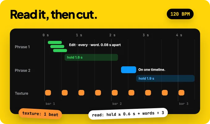
A structure that works for 10 to 60 seconds of kinetic type: hook, build, punch, resolve. Three to seven words per scene, one lead word per scene that gets the biggest move, and a still final line held for two to three seconds so viewers can read the name.
One title, every format
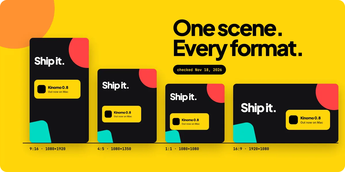
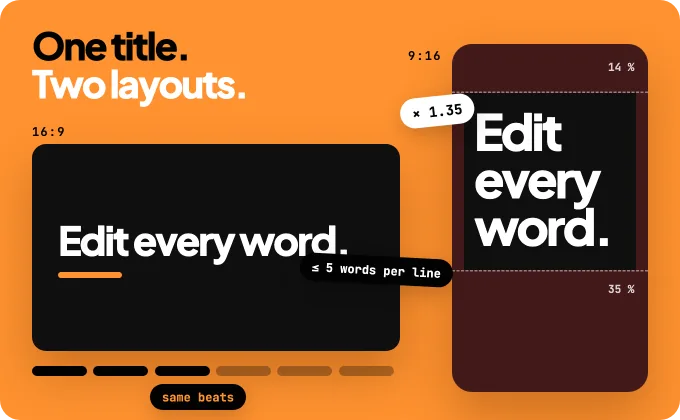
The same title doesn't fit 16:9 and 9:16 by cropping. A 16:9 frame cropped to 9:16 keeps less than a third of its width, so a horizontal line is cut on both sides. Lay each format out on its own instead:
- 16:9: one or two lines, room to breathe on the sides, the lead word can travel horizontally.
- 9:16: titles about 1.35 times their 16:9 size, around five words per line, two lines at most, stacked and set higher in the frame, inside the safe zone.
- 1:1 and 4:5: tighter framing, usually one more line break than in 16:9.
The beats stay the same in every format: same words, same timing, same cuts. Only layout, size and framing change. For every platform's sizes and safe zones, see our social media video sizes for 2026.
Where kinetic typography works
- Launch videos. The claim in three to six words, the product on screen to prove it. Our guide to making a product launch video with Claude shows the full structure.
- Explainers. Chapter titles, a definition, the one number that matters.
- Reels, Shorts and TikTok. A hook readable sound-off in the first second and a half, then one idea per screen.
- Lyric videos and title sequences. The original home of the form.
Where it doesn't: paragraphs, legal text and dense data. Put those on a still card or in a voice-over.
How to make kinetic typography, step by step
You can follow these steps in any tool. They also work when an AI agent like Claude Code writes the layout and timing of every word: the agent can apply numbers, but it can't feel whether a phrase landed, so the last step stays yours.
- Write the words first. Cut the script into beats of eight words or fewer. Mark which words must be read and which are texture.
- Pick the formats before the first frame. Name every format the video needs (for example 9:16 first, then 16:9) so each is designed, not cropped.
- Choose one display face in several weights and a two-colour palette: a ground and an ink. Check that the font's licence covers video.
- Give the agent the rules, as numbers it can apply (see the brief below).
- Keep text as text. Each word should be its own element that you can retime or rewrite, not pixels baked into a video.
- Check at phone size. Look at a strip of frames at real phone width and run the size, length and hold checks on every format.
- Take over by hand. Retime a hold, fix a line break, change a word. That's where the piece gets its feel.
- Words: "Edit every word. / On one timeline. / Kinomo." Nothing else on screen.
- Formats: 9:16 first, then 16:9. Lay each out natively; never crop.
- Type: one display face in 700 and 800. Ground #30D158, ink #020202.
- Size: characters ≥ 2.6 % of the short side (28 px at 1080). 9:16 titles 1.35× the 16:9 size.
- Length: ≤ 8 words per text, ≤ 5 words per line in 9:16, 2 lines max.
- Hold: 0.6 s + words ÷ 3 once still. Last line 2–3 s.
- Entrances: by meaning, never the same twice in a row, never from scale 0.
- Stagger: words 0.06–0.12 s apart. A landed word stays still.
- Safe zone: no text in the top 14 %, bottom 35 %, sides 6 % in 9:16.
For the motion itself (curves, durations, who leads), read our motion design principles for AI agents.
Where Kinomo fits
Kinomo is the Mac animation app we build, where your AI agent animates over MCP while you watch, and you can take over at any moment. For kinetic typography, that means:
- Text stays text. Scenes are HTML and CSS layers, and each word can be its own element. You or your agent can change a word, a font or a size and see it at once, without re-rendering a video.
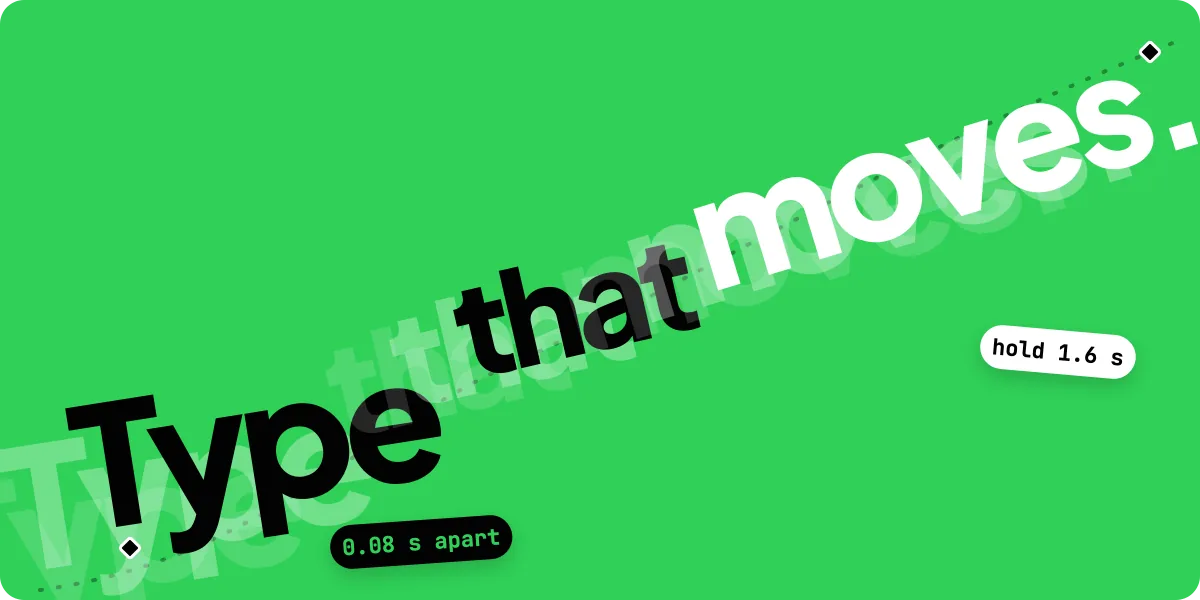
- A kinetic typography recipe for your agent. The Kinomo skill includes a kinetic typography recipe (hook, build, punch, resolve; one face in several weights; entrances chosen by meaning; swaps that keep the line's width) and a ready-made giant-title move with words 0.08 s apart.
- Checks for reading.
lint_filmflags text too small (TXT_TOO_SMALL), too long (TXT_TOO_LONG) or held too briefly (TXT_TOO_BRIEF) in every format, andrender_stripshows the frames at real phone width. - Every format on one timeline. 16:9, 9:16, 1:1, 4:5 and 3:2 share the same beats, and each keeps its own layout.
- On the beat. Kinomo finds your music's tempo on your Mac and lays a bar grid, so holds can be counted in beats.
Kinomo runs on macOS 15 or later with Apple silicon. Free plan. Paid plans from $50/year. Download Kinomo for Mac, or see how it fits with other tools in our comparison of motion graphics software for Mac.
Limits worth knowing
- Rules aren't taste. Numbers remove the worst mistakes. A weak line, perfectly timed, is still weak.
- Checks measure size, length and time, not meaning. A readable line can still be the wrong line.
- Moving text is harder for some viewers. Keep essential information still long enough, and add captions when there is a voice.
- Agents can't watch. They can render frames and run checks; plan a human pass before you publish.
Frequently asked questions
What is kinetic typography?
Kinetic typography is an animation technique that puts text in motion to express an idea or an emotion. The words are the main subject of the video: they enter, change and land in time with their meaning or the music.
Can you give me an example of kinetic typography?
Saul Bass's opening titles for North by Northwest (1959), where credits glide across a grid that becomes a building facade, are often cited as the first. Kyle Cooper's titles for Se7en (1995) and today's lyric videos and launch films are later examples.
What is the best font for kinetic typography?
There is no single best font. Heavy sans serifs with open shapes and several weights read best in motion and on phones. Use one family, contrast by weight and size, avoid thin weights at small sizes, and check the licence covers video.
What software is used for kinetic typography?
After Effects and Apple Motion with keyframes, code frameworks such as Remotion and HyperFrames, and agent-driven apps like Kinomo. Our motion graphics software guide compares them.
Can AI make kinetic typography?
Yes, with limits. An AI agent can write the layout and timing of each word and check size and hold times, but it can't judge feel. Give it rules in numbers, then retime by hand. See AI motion graphics you can edit.
What is the difference between kinetic typography and animated captions?
Captions transcribe speech and follow the voice. Kinetic typography carries the message itself, in a few words per scene, timed to meaning and music, and it should make sense with the sound off.
Conclusion
Kinetic typography is the words doing the work: few of them, large enough, still long enough to read, and laid out for each screen. Write the words first, give your agent the numbers, check at phone size, and keep your hands on the timing.
Keep going with How to make a product launch video with Claude, then download Kinomo for Mac. Free plan. Paid plans from $50/year.
Sources · checked on Nov 18, 2026
- Wikipedia, "Kinetic typography" (definition, 1959–1960 Bass titles, 1982 Channel 4 ident, Brownie's motion/fluid model) · en.wikipedia.org/wiki/Kinetic_typography
- Art of the Title, *North by Northwest* (Saul Bass, 1959) · artofthetitle.com/title/north-by-northwest
- Art of the Title, *Se7en* (Kyle Cooper, 1995) · artofthetitle.com/title/se7en
- BBC Subtitle Guidelines, section 4 "Timing" · bbc.co.uk/accessibility/forproducts/guides/subtitles
- W3C, Understanding WCAG 2.2, SC 1.4.3 Contrast (Minimum) · w3.org/WAI/WCAG22/Understanding/contrast-minimum.html
- W3C, Understanding WCAG 2.2, SC 2.3.1 Three Flashes or Below Threshold · w3.org/WAI/WCAG22/Understanding/three-flashes-or-below-threshold.html
- Meta Ads Guide, Instagram Reels (safe zone 14 % / 35 % / 6 %) · facebook.com/business/ads-guide/update/video/instagram-reels
- Kinomo skill v1.18.0 (recipes, menus, anti-slide, formats) and site, Kinomo 0.8.0